
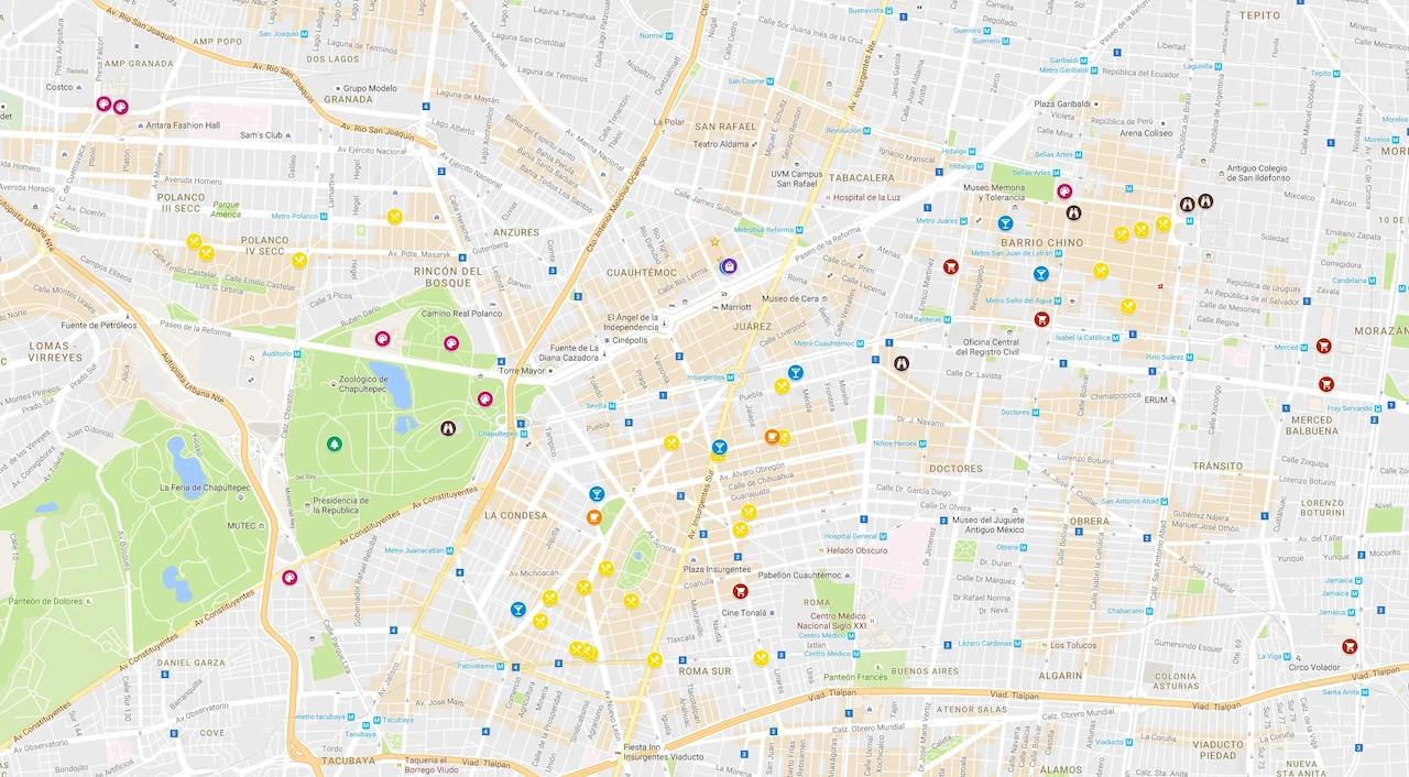
If you opened Google Maps during your morning commute and felt like your phone had swapped apps overnight, you are not alone. Google has rolled out a sweeping visual and functional redesign to Android devices worldwide. Because this change arrived via a server-side switch rather than a manual update from the Google Play Store, the interface transformed overnight for millions of daily travelers.
The goal behind this overhaul is simple: reduce visual noise, boost legibility under harsh lighting, and align the mapping experience with modern Android aesthetics. Over time, Google Maps had become cluttered with floating chips, full-screen popups, and dense menus that obscured the underlying map. This update strips away that excess.
Everything from the core color palette to the navigation tabs at the bottom of your screen has been updated. Roads appear crisper, parks and water bodies stand out with distinct hues, and full-screen menus have yielded to floating, dismissible cards that keep your geographic context visible at all times.
The Updated Color Palette
The most noticeable change in this redesign is the new color scheme. For years, Google Maps relied on warm grays for roads, vivid yellow-orange for highways, and a muted olive-green for natural areas. That familiar look has been replaced by a crisp, cooler palette built for high-contrast readability.
- Highways and freeways: Major corridors now appear in a solid slate gray-blue rather than bright yellow or orange, separating clearly from local streets.
- Parks and greenery: Nature preserves, fields, and neighborhood parks now feature a cool minty sage green instead of earthy olive.
- Water bodies: Oceans, lakes, and rivers have shifted from light sky blue to a deeper teal that creates a sharp boundary against coastal land.
- Transit routes: Bus lines and rail tracks stand out with saturated accent colors, making complex interchanges easier to follow at a glance.
This shift directly improves visibility. Under direct midday sunlight, the older yellow highway markers frequently washed out against white map tiles. The cooler, higher-contrast tones hold their structural lines whether your screen is fighting glare or running in dark mode on an OLED panel.
The updated aesthetic also aligns Google Maps for mobile with the high-clarity interfaces used in Android Auto and dedicated car navigation units, making the transition between your phone and your vehicle dashboard seamless.
A Simplified Bottom Bar
Along with the visual overhaul, Google streamlined the main navigation bar at the bottom of the screen. Older versions crammed up to five separate tabs along the bottom margin. The new layout pares that list down to focus on your most frequent actions.
The bottom bar now centers on core navigation pillars, typically consolidating controls into Explore, You (which merges the old Saved and Commute options), and Contribute. This consolidation clears horizontal space and eliminates redundant buttons.
Key tools now live in specific hubs:
- Saved places and lists: Located inside the unified You tab, gathering your favorite spots and custom travel lists into a single scrollable feed.
- Recent searches and timeline: Accessible directly through the search bar drop-down or your profile hub.
- Settings and offline maps: Stored beneath your profile avatar in the upper right corner, organized with cleaner sub-menus.
Crucially, tapping a location or search result no longer triggers a full-screen white overlay. Information now slides up in compact, rounded floating sheets. A wide margin of the map remains visible around the edges, keeping your surroundings in view while you check business hours or browse reviews.
Redesigned Route Cards and Search Overlays
Interacting with search results and route options feels cleaner thanks to the new floating card architecture. When you search for a coffee shop or gas station, the resulting sheet hovers over the map with subtle drop shadows and rounded corners.
A simple downward swipe dismisses the card completely, eliminating the hunt for a tiny “X” icon. Dragging the card upward expands details, photos, and menus progressively without covering the entire map canvas.
Public transit riders will notice several specific improvements:
- Side-by-side mode comparisons: Driving, walking, ridesharing, and transit options show trip times and estimated costs in a tidy horizontal strip.
- Live arrival indicators: Real-time tracking badges use clear green and red indicators to signal whether your bus or train is on schedule, delayed, or ahead of time.
- Clearer transfer points: Walking segments between connections specify exact station entrances and step counts.
Managing visual layers is also faster. The Map Layers button in the upper right now opens a clean grid of circular toggles, allowing you to switch between terrain, satellite view, 3D buildings, and live traffic in two quick taps.
Turn-by-Turn Navigation Tweaks
Once you start active navigation, the interface prioritizes immediate readability. The top green turn banner uses a bolder font and larger directional arrows, making complex maneuvering instructions easy to parse in a brief glance.
Lane guidance is significantly clearer on multi-lane highways and complicated splits. The correct lanes light up with crisp white arrows while unavailable lanes fade to a muted translucent gray, taking the stress out of sudden freeway exits in heavy traffic.
Glanceable directions and lock-screen alerts have also been refined. When your phone is mounted on a dashboard, critical alerts, speed limits, and upcoming turns stand out in high-contrast text that stays legible even when your screen dims to conserve battery.
For walking navigation, the directional beam extending from your blue position dot is far more responsive. When you step out of a subway station into an unfamiliar intersection, the blue cone reacts instantly to your phone’s gyroscope, showing you which way to face before you take your first step.
Practical Tips to New Maps Layout
If you want to tailor the refreshed Google Maps interface to your habits, a few quick adjustments will help you settle in faster.
- Adjust your theme settings: If the bright daytime palette feels too intense, go to Profile > Settings > Theme and select Always in Dark Theme to shift the map into softer charcoal grays and slates.
- Pin your daily routes: Keep frequent trips accessible by searching your destination, tapping Directions, selecting your transit mode, and pressing the Pin button at the bottom of the screen. Pinned routes will stay saved in your You tab.
- Clean up map details: If 3D buildings or transit overlays clutter your view, tap the Layers icon on the main screen and turn off extra features to maintain a minimal map display.
If your app hasn’t updated yet, keep in mind that this rollout is managed server-side by account and region. You can attempt to trigger the change by going to your phone’s Settings > Apps > Google Maps, tapping Force Stop, and clearing the app cache. Ensure you have the latest app version installed from the Play Store, and the new design should appear soon.