
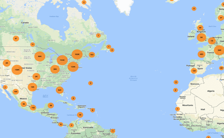
If you’ve ever glanced at Google Maps and tried to find the liveliest block, a quiet park, or the fastest route at a glance, you were reading a deliberate color language—one designed so your eye registers place types faster than you can read labels.
Knowing what those colors usually mean helps you pick a neighborhood for dinner, avoid a traffic bottleneck, or design a cleaner map for your app. Below are the practical cues that experienced map readers use.
What the background colors usually indicate
The map’s base layer (landcover and landuse styling) gives broad context before any labels load. These shades are intentionally muted so icons and text remain legible as you zoom and pan.
- Pale gray / off-white: Typical residential blocks and general urban fabric.
- Light yellow / tan: Commercial cores and dense business districts—places with many shops, restaurants, and services.
- Soft mint green: Public parks, greenways, golf courses, and botanical gardens.
- Teal / pale blue: Water bodies: rivers, lakes, reservoirs, and coastal areas.
- Light beige / warm tan: Large institutional grounds such as some campuses, airports, and bases—areas mapped as specialized land use.
- Dark gray: Industrial zones, large facility footprints, and major transport terminals.
Practical tip: when you’re scanning a city for activity, head toward clusters of light-yellow shading—they often mark districts where many businesses are open and walkable.
How roads are colored and what traffic colors mean
Road styling communicates hierarchy and live conditions at a glance: line width and color tell you whether you’re looking at an interstate, a local street, or your route.
Road hierarchy and visual cues
Primary highways and interstates use thicker strokes and darker, desaturated tones so they’re visible without overpowering nearby POI markers. Secondary arterials are slightly lighter; local streets are thin and subtle. This layering keeps navigation arrows and transit lines readable.
Real-time traffic overlay
When the traffic layer is active, Google overlays a progressive color scale to indicate flow and delays:
- Green: Traffic is flowing smoothly.
- Orange / Amber: Moderate slowdowns.
- Red: Heavy congestion or notable delays.
- Dark red / burgundy: Severe congestion, accidents, or near-standstills.
- Blue: Your active navigation route (colored to stand out from traffic overlays).
Practical tip: if you want a quick estimate of delay on a route without starting navigation, glance for where red or dark-red bands cluster along the corridor you plan to use.
Why Google shifted to a cooler, muted palette
Recent design updates moved away from saturated, high-contrast colors toward a softer teal-and-gray scheme. That change wasn’t just aesthetic—three practical goals drove it:
- Better foreground emphasis: Muted backgrounds make turn arrows, pins, and text read more clearly.
- Consistency across devices: A restrained palette reproduces more predictably across phones, desktops, and in-car displays.
- Lower distraction: Less saturated maps reduce glare and visual noise, especially for drivers glancing at the screen.
Practical tip: if a redesign feels “duller” at first, it’s often because the map is prioritizing immediate legibility and safety over memorability.
How POI pins and markers use color to communicate categories
Pins and icons are small but powerful: color and shape group similar services so you can scan a dense map quickly. Google uses category-driven colors and then variants for special states (selected, saved, or promoted locations).
- Food & drink (commonly warm tones): Restaurants, cafes, and bars are often highlighted in warm hues to stand out in a city view.
- Retail & services (commonly blue tones): Shops, banks, and general services are frequently rendered in blue variants.
- Health & medical (red/pink variants): Hospitals, clinics, and pharmacies typically use red-tinted markers to signal urgency or care.
- Entertainment & culture (teal / cyan variants): Museums, theaters, and venues get distinct cool colors to separate them from commerce markers.
- Outdoors & recreation (green variants): Sports facilities, trails, and parks use green to reinforce the association with open space.
- Lodging (purple / magenta variants): Hotels and accommodations often use a reserved, contrasting color so travelers can spot them quickly.
Saved or labeled places use different shapes and colors (stars, flags, hearts) so your personal pins sit visually above the standard POI markers.
How Dark Mode changes the map and why it matters
Switching to Dark Mode in Google Maps applies a high-contrast, low-luminance palette rather than a simple color inversion. Backgrounds become deep slate or near black, while roads and POIs shift to lighter grays and brighter accent colors for visibility.
- Reduced glare preserves night vision and lowers distraction for drivers.
- OLED screens benefit from lower power use because true dark pixels draw less battery.
- Traffic and route indicators are given brighter, high-contrast hues so they remain immediately legible against a dark canvas.
Practical tip: test your route in both light and dark modes if you’ll be arriving early or late—the map’s visibility can change depending on ambient light and device settings.
Applying Google Maps color principles to your own maps
If you’re styling maps for a website or app, borrow these practical rules to make a usable, scannable experience:
- Mute base layers: Keep landcover and background tones low-saturation so labels and actionable markers pop.
- Reuse familiar semantics: Keep water blue and parks green—familiar colors reduce cognitive load for users.
- Reserve saturation for calls to action: Use bright, contrasting colors for search results, selected routes, and CTAs so they sit on top of the visual hierarchy.
- Test at multiple zoom levels and lighting conditions: What looks good at city scale can become clutter at neighborhood scale; check dark and light modes, too.
- Consider accessibility: Ensure sufficient contrast between foreground labels/icons and background tiles; don’t rely on color alone to communicate critical information.
Understanding these color cues will make you a faster, more confident map reader—and help you design maps that communicate clearly under real-world conditions.