
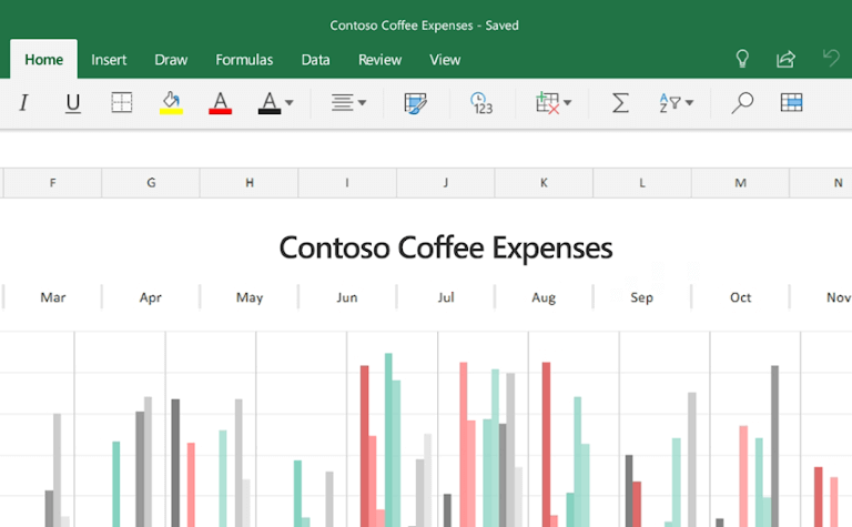
A spreadsheet can be completely accurate and still fail as a business document. If the important numbers are buried under dense gridlines, uneven columns, random colors, and raw decimals, most people won’t know where to look first — and that’s a real problem when a manager, client, or executive only has a minute to scan it.
Good Excel formatting isn’t decoration. It’s a way of making the structure of the data obvious: what matters, what belongs together, and where the reader should focus. This guide walks through practical formatting habits that turn a default worksheet into something that reads like a polished report. The goal isn’t to make your spreadsheet flashy — it’s to make it effortless to understand.
Why Default Excel Looks Unprofessional
A new worksheet starts as a blank grid of identical cells. That’s fine for entering data, but it’s a poor final presentation format. When every cell has the same visual weight, readers have to work to identify headings, totals, dates, and exceptions. Their eyes jump around looking for context, even when the answer is right there.
Default styling tends to create clutter in a few predictable ways:
- Gridlines make every empty cell look like part of the report.
- Bright yellow, red, blue, and green fills compete for attention.
- Inconsistent fonts and sizes make a sheet look assembled rather than designed.
- Long numbers without separators or symbols are slow to scan.
- Default column widths force readers to decipher truncated labels.
Most readers don’t need to inspect every formula. They need to find the headline result, compare major categories, spot anything unusual, and understand what to do next. Formatting should guide them through those steps in that order. A useful rule of thumb: make important information prominent, supporting information quiet, and empty space intentional. That one idea improves almost any spreadsheet on its own.
Build a Visual Hierarchy with Typography
Typography is one of the fastest ways to make a spreadsheet look professional, and you don’t need a special font to do it — you need consistency.
Pick one readable sans-serif font that’s available wherever the file will be opened. Not every computer has the same fonts installed, so an unusual typeface can quietly break your layout for someone else. If your company has a standard font, use it. Otherwise, stick with something common and easy to read.
Create a simple type scale
Use a small, repeatable set of text sizes instead of adjusting size randomly as you go:
- Report or workbook title: larger, bold text
- Section heading: smaller than the title, still bold
- Table header: bold, consistent across the sheet
- Body data: one standard size, regular weight
- Notes and sources: smaller and visually quiet
The exact point sizes matter less than the relationships between them. A title should obviously look like a title. A header should obviously look different from a data row. Notes shouldn’t compete with the numbers they’re explaining. For a monthly report, that might mean a bold title at the top, a smaller reporting-period label underneath, then a blank row before the table starts — a simple pattern that tells the reader exactly where the report begins.
Use bold sparingly
If everything is bold, nothing stands out. Save it for titles, header rows, totals, and the handful of values that genuinely deserve attention. A quick test: zoom out slightly. If the key sections and totals are still easy to spot, your hierarchy is working. If the whole sheet looks equally dark and busy, dial back the bold text, heavy borders, and colored fills.
The Golden Rule of Color: Restraint Over Rainbows
Color should communicate meaning, not decorate every cell. A sheet with five bright fills might feel lively while you’re building it, but it usually becomes exhausting to read later.
Stick to a limited palette — two or three muted tones is plenty. A practical setup might include one dark neutral color for headers, one light complementary fill for section labels or input areas, and one accent color for a key metric or alert. A soft blue-gray header paired with a pale blue section fill and a restrained orange accent can look clean and report-like without much effort. The important part is consistency: if pale blue means input cells on one tab, don’t reuse it to mean completed tasks on another.
Make color meaningful
Before adding a fill, ask what it’s actually telling the reader. Color is useful for marking a heading or section break, an editable input, a calculated result, a warning or exception, or a positive or negative trend. If a fill doesn’t do one of those jobs, it probably doesn’t need to be there.
Design for accessibility, not just your own screen
Don’t rely on red and green alone to signal good and bad results — some readers have trouble distinguishing them, especially in small cells or on low-contrast displays. A safer option is to pair color with a second cue: an arrow, a plus or minus sign, or a text label like Above Target and Below Target when the meaning really matters.
Contrast matters too. Dark text on a lightly tinted fill is usually easier to read than white text on a medium-bright color. Save white text for genuinely dark header fills where the contrast is unmistakable.
Headers That Anchor Your Data
Headers are the map of your spreadsheet. If they’re weak or vague, everything below them starts to look like a wall of numbers.
A good header row answers three questions at a glance: what does this column contain, what unit is being used, and how should the values be read? Swap out vague labels like Value, Amount, or Date for something specific — Revenue, Forecast Revenue, Invoice Date, or Variance to Budget tell the reader far more.
Apply alignment intentionally
Text usually scans best left-aligned. Numbers scan best right-aligned, since their digits line up by place value. Dates often work well centered or right-aligned, as long as you’re consistent about it. Don’t center everything by default — it’s great for short headers and status labels, but it makes long text and lists harder to read.
Build a header style once, then reuse it
Settle on one header style: bold text, a dark or muted fill, high-contrast text color, appropriate alignment, and a little extra row height for breathing room. Keep it clean rather than decorative — heavy gradients, mixed font colors, and thick black borders tend to make a sheet feel dated.
If a table runs beyond the visible screen, turn on Freeze Panes so the header stays put while readers scroll. Nobody should have to scroll back to row one to remember what a column means.
Avoid merged cells in working data areas
Merging cells is tempting when you want a title centered across several columns, but merged cells interfere with sorting, filtering, copying, and formulas — especially inside tables. Instead, use Center Across Selection: select the range, open Format Cells, go to the Alignment tab, and choose Center Across Selection from the Horizontal dropdown. You get the same centered look without breaking anything you’ll need later.
Formatting Numbers for Instant Readability
Raw numbers create unnecessary work for the reader. Nobody should have to guess whether 1250000 means dollars, units, or a ratio — the format should make it obvious.
Keep number formats consistent within a column. Don’t mix currency symbols, plain numbers, and different decimal places for values that represent the same kind of measure.
Match the format to the data
- Currency: use a currency or accounting format, and only include decimals when they matter.
- Percentages: format ratios as percentages instead of leaving values like 0.18 in the table.
- Whole numbers: use thousands separators for counts, units, and similar measures.
- Dates: pick one clear format that can’t be misread by someone in another region.
- Negative values: make them easy to spot with a minus sign, parentheses, or a restrained color paired with a non-color cue.
Compare 1250000, 0.0834, and -55400 with $1,250,000, 8.3%, and ($55,400). The second version is faster to read because it supplies context at a glance instead of making the reader do the translation.
Use custom formats to reduce noise
Custom number formats let you clean up the display without touching the underlying value — useful when a dashboard needs to show figures in thousands or millions while the source data stays precise. Just make the unit obvious somewhere on the sheet, so nobody has to guess whether 1.3M means 1.3 million, 1,300, or 1.3 percent.
It’s also worth deciding whether zeros should show at all. In a dense operational report, a dash can be easier to scan than a column full of zeroes. In a financial model, showing the zero is often the safer choice. Pick based on what the reader actually needs to verify.
Using Borders and Gridlines Strategically
Gridlines are helpful while you’re building a sheet. They’re not always helpful once you’re presenting it. For a report-style layout, try hiding default gridlines from the View tab — the sheet often looks calmer immediately. Just don’t leave the reader with zero structure; replace them with deliberate visual guides instead.
Use borders as separators, not cages
Thin, light-gray borders are usually enough to separate rows or define a small table. Avoid boxing every single cell — that creates a heavy, dated look. A clean approach might include a bottom border under the header row, light horizontal lines between major groups, a stronger top border above a subtotal, and little or no vertical borders unless columns are genuinely hard to distinguish. Think of borders as lanes on a road: they should help the reader move through the sheet, not fence in every value.
Conditional Formatting with a Light Touch
Conditional formatting can turn a plain table into an easy-to-scan summary, or it can turn a useful report into a patchwork of competing colors. The difference is restraint.
It works best when it reveals a pattern that would otherwise take careful reading to spot: data bars showing relative sales volume across regions, a color scale across a compact range of performance values, icons showing whether a metric is above or below target, or a highlight for overdue dates and out-of-range values.
Keep rules focused
Don’t stack every available rule on the same range. A cell shouldn’t have a data bar, an icon, a colored fill, bold text, and a custom border all at once — pick the one visual cue that best communicates the thing the reader needs to notice. Apply rules to the actual data range rather than entire columns; formatting hundreds of thousands of unused cells adds unnecessary weight to the file and makes the workbook harder to maintain.
Watch for unnecessary buildup
Over-formatting can make a workbook heavier and slower to work with, especially once it accumulates many conditional formatting rules, duplicate styles, or formatting applied far beyond the real dataset. Before sharing a workbook, it’s worth opening the Conditional Formatting Rules Manager — it’s common to find old rules left behind after copied sheets, changed ranges, or revised reports. Removing them keeps the file lean and keeps future edits predictable.
Structuring Layouts with Whitespace and Column Widths
Whitespace isn’t wasted space — it’s what stops a spreadsheet from looking like a raw database export. Give your data room to breathe: add blank rows between major sections, leave a margin column at the edge of a report, and keep input assumptions visually separate from calculated outputs.
Set column widths for the content
Default column widths are rarely right for the actual data. Widen description columns enough for meaningful labels, keep short fields like month or status compact, and give currency and percentage columns enough room to show the full formatted value. Use Wrap Text for a long header when widening the whole column would throw off the table’s proportions. AutoFit is a fine starting point, but don’t rely on it entirely — one unusually long value can make it stretch a column to an awkward width.
Use row height to create rhythm
Slightly taller header rows improve readability, and blank rows help separate sections. Wrapped text may need extra row height so nothing gets hidden. At the same time, avoid making every row tall — readers see less on screen and have to scroll more. Save the extra space for sections, titles, and notes, not every ordinary data row.
Organize the sheet like a report
A useful executive-facing worksheet usually follows a simple flow from top to bottom:
- A clear title and reporting period
- A small group of key metrics or headline findings
- The main table or chart
- Supporting detail below or on a separate tab
- Notes, assumptions, and definitions at the bottom
This keeps the decision-making view separate from the detailed working data. If the workbook contains formulas, imports, or helper tables, put those on clearly named supporting sheets instead of mixing them into the presentation area.
Prepping for Print and Sharing
A sheet that looks perfect on your monitor can fall apart the moment someone prints it or opens it on a laptop. Before sending a workbook out, check Page Layout and Print Preview. Set a print area so you’re not exporting fifty blank columns by accident, and use Print Titles so header rows repeat on every printed page instead of only appearing once at the top.
If the file is going to people outside your team, consider exporting a final version to PDF. It locks the layout, prevents accidental edits to formulas, and guarantees the formatting looks the same on every device — no font substitutions, no column widths shifting because of a different screen resolution. For anything meant to be read rather than edited, PDF is often the safer final format.
A Practical Cleanup Routine for Any Excel Sheet
If you inherit a messy spreadsheet, don’t try to fix every visual issue at once. Work through it in order:
- Clarify the purpose. Decide what the reader should understand or act on.
- Remove distractions. Hide gridlines if it’s becoming a report, clear random fills, and remove unnecessary bolding.
- Create hierarchy. Style the title, section labels, headers, totals, and notes consistently.
- Standardize number formats. Make units, dates, decimals, and negatives consistent.
- Resize the layout. Adjust columns, rows, wrapped headers, and whitespace.
- Add selective emphasis. Use borders and conditional formatting only where they help readers spot a trend or exception.
- Test the reading experience. Scroll, filter, check print preview, and view the sheet at normal zoom.
That final check matters more than it seems. A sheet can look perfect in the small area where you were editing while still falling apart the moment someone scrolls further down, prints it, or opens it on a smaller display.
The best-formatted Excel sheets don’t call attention to their own formatting. They make the answer feel obvious before the reader has consciously started looking for it. Before you send your next workbook, ask one simple question: if someone saw this for the first time, would the most important number be impossible to miss? If the answer isn’t an easy yes, that’s usually a sign to go back to hierarchy and color rather than adding more detail.